Oathtaker.com
Friend and follow Patricia Reding
  • Home
  • Patricia's Blog and Interviews
  • Patricia's Reviews of Other Works

November posting for A Drift of Quills on NaNoWriMo

11/7/2014

0 Comments

 
Picture
I've decided to go first this time!

I admit I’ve never participated in the event known as NaNoWriMo. I can’t even pronounce it, and I have to check other sources for how to spell it every time I need to use the word, or acronym, or whatever it is. Suffice it to say, I don’t know much about it. Still, from what I’ve heard, it sounds like an amazing venture . . .

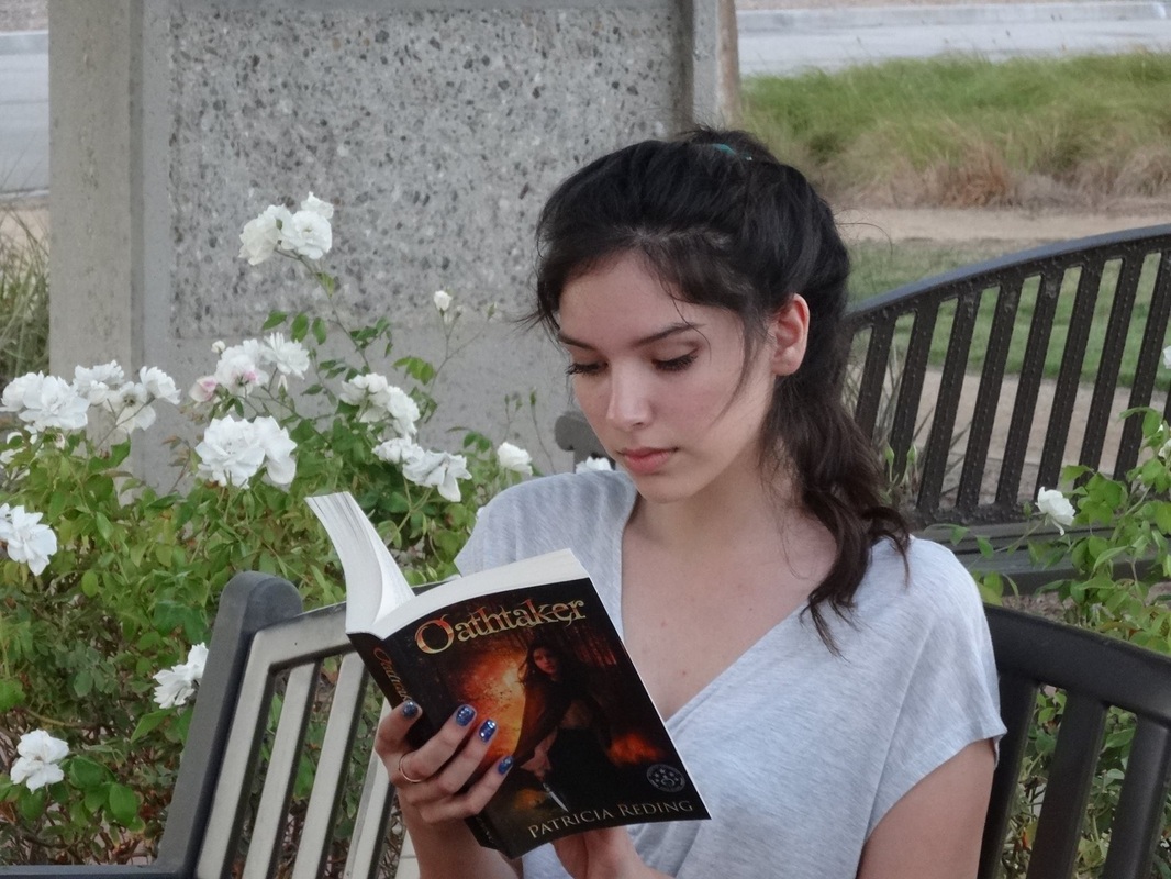
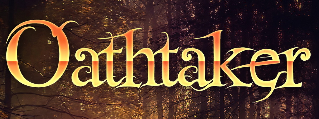
The closest I’ve ever come to a NaNoWriMo effort was during a summer week when the rest of my family went camping. Blissfully alone (and, I confess, not lonely), I set out to write the opening of my new story. The words tumbled off my fingertips as though they’d been dying to get out. I’m not sure how many words I wrote that week, but I managed to get out the first five chapters (each with several “scenes”) and to this day, they are some of my favorite. They set the stage for the story, Select, the first sequel to Oathtaker, that I am currently writing. The most fun has been allowing some readers a “sneak peek” at them (and leaving those writers on a cliff!).
Picture
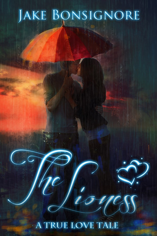
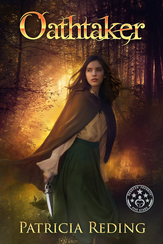
As to the 2014 NaNoWriMo event, alas, I will not participate. My life has been a scrambled jumble of odd events and . . . difficulties in 2014. The one bright spot has been the award that Oathtaker won in the 2014 Readers’ Favorite International Book Award contest. Readers’ Favorite is hosting an event in Miami at the same time as the Miami Book Fair International Street Fair, so I’ve decided to attend. Perhaps I’ll meet someone there from WindDancer Films, the film production company that has asked to take a look at Oathtaker. That would be fun . . . 

So for all of you participating in NaNoWriMo, keep up the good work! I am anxious, come December, to hear about the results of your efforts . . .


Picture
Next up is  Robin Lythgoe, author of As the Crow Flies.

You may also have noticed that it is November, and November means NaNoWriMo (National Novel Writing Month). While Patricia is off flitting about the countryside, Kristie and I are knee-deep into the crazy, wonderful writing frenzy that is NaNoWriMo.

Do you know what that means? Hundreds of thousands of people around the world leap headlong into the challenge of writing a novel (50,000 words long!) in thirty days. (Though if I wrote through Thanksgiving Day, I would probably be stuffed and roasted!)

Read more on Robin's site here.


Picture
Finally, Kristie Kiessling. author of Sanguis Dei, has the following to offer:

NaNoWriMo or National Novel Writing Month is upon us! If it's possible that you've never heard of it, the NaNoWriMo website says this:

"National Novel Writing Month is a fun, seat-of-your-pants approach to novel writing. Participants begin writing on November 1. The goal is to write a 50,000-word (approximately 175-page) novel by 11:59:59 PM on November 30."

Sound crazy? You bet! But it's wonderful, too. Why? 


Read more on Kristie's site here.


Thank you for joining us! We look forward to sharing with you again in December.

0 Comments

Inspiration

10/4/2014

0 Comments

 
It is time for the October posting for:
Picture
This month, with guest author, Joshua Grasso, we Quills tell a bit about what inspires our writing. 


First  up, is Joshua Grasso, professor of English Literature, and the author of The Count of the Living Death and The Astrologer's Portrait, both available on Amazon.
Picture
My ideas always come from the same source: usually a work of art, but sometimes, a stray moment or character from an old book.  As a professor, I spend even more time than most people in books, and my teaching and research requires me to delve into all kinds of documents: epic poems, Renaissance art, odd biographies, scientific treatises, revenge tragedies, etc.  As a teacher/scholar I’m looking for context for a paper or to explain something in class; as a writer, however, my eyes are alert for some small, teasing detail that suggests a larger narrative.  I always believe the best material is just waiting for you to stumble over, though if you look/read too myopically, you’ll scatter the riches lying at your feet. 

For example, the novel I’m currently writing came to me in a flash—the initial idea, anyway—from a painting I intended to use in class.  The painting is Portrait of a Young Woman (1435) by Rogier van der Weyden.  This beautiful, almost photo-realistic portrait of a woman wearing a ‘winged turban’ made me forget my lesson plan.  I found myself trying to piece together the expression in her eyes, the rigidity of her body language, and the emotion the painter hoped to capture in the portrait.  The germ of a story fell right into my lap, and I’ve spent the past two summers trying to make it into a proper story.  I’m light years beyond the photo now, but I still keep it right at my desk to remind me of my initial inspiration. 

Sometimes, however, I simply don’t have time to start writing a novel or story on every stray clue from the ancient world.  In fact, my most recent novel, The Astrologer’s Portrait, was inspired by a strange character from the Bayeux Tapestry—a person named ‘Turold.’  I read a book about the Tapestry which hinted at who this might be and the wheels started turning.  But classes prevented me from doing anything with this for a year, so I simply had to add the clue to my notebook: “Turold in Bayeux Tapestry—sorcerer?”  A year or so later I stumbled on the note and it all came flooding back.  Three years later the novel was finished, and though it doesn’t resemble the character from the Tapestry in the slightest, I still maintain that the ancient Turold planted the seed of my modern work. 


For more about Joshua and his works, see:

Website, The Virtual Astrolabe: www.hblackbeard.blogspot.com

The Count of the Living Death (Amazon): http://www.amazon.com/Count-Living-Chronicles-Hildigrim-Blackbeard-ebook/dp/B00FQ6711Y/ref=pd_rhf_gw_s_t_1

The Astrologer’s Portrait (Amazon): http://www.amazon.com/The-Astrologers-Portrait-Joshua-Grasso-ebook/dp/B00LKQ0DXC/ref=pd_sim_kstore_2?ie=UTF8&refRID=1E8QVX7727JS51MG5KY0


Picture
Next up, is Robin Lythgoe, author of As the Crow Flies.


Inspiration comes at me from every direction! Music, other books, news, dreams, conversation, pictures, quotes, you name it! Any of those things can easily set me to wondering how one of my characters might react or how the setting or culture or plot could be changed by employing the “what if” factor. They can spark ideas for new characters and settings, or generate an idea to help me fix problems. In fact…

Read more here.


Picture
Kristie Kiessling, author of Sanguis Dei and a poetry collection, Light and Dark, also chimed in.

My story ideas come largely from life. As a young poet of five, I heard my kindergarten teacher say, "Write about what you love and what you know." Write What You Know has become a motto for me. I delve into the people I know, the place where I live, the situations and dramas around me to provide the fodder for my lyrical and literary creations. It is very simple, really. I'm a woman, an artist, a mother, a wife--all these things are in large part instinctual for me. The visceral manner in which I respond to everything I come in contact with inspires me. Emotion and reaction is key. If something moves me, then  . . .

Read more here.


Picture
Finally, I have a few words . . .

My ideas come from numerous sources. Perhaps most notable are those bits of wisdom I’ve come upon over the years, either from some third party, or via some inspiration (or revelation, as the case may be). I like to take these gems and create characters out of them, or use them to move a character through my story or to draw and shape the world in which my stories are told. Sometimes I can use them “as is.” Other times, I ask myself how things might operate but for those principles.

Many people I’ve known over the years, either personally, or via the societal impact those people have had, also have inspired my writing. While no fictional character is the “same” as someone I’ve known or known of, I frequently use characteristics of people I’ve been familiar with to create my own fictional characters. Indeed, it can be incredibly therapeutic to impart some characteristic of a real person, physical or otherwise, to a fictional character, then take the opportunity to praise that character for it—or to put him in his place. In fact, in Oathtaker, there are a couple of conversations that were lifted from my own life. One is a situation when someone asks if it is true that ignorance is bliss. The response: “What is ‘bliss?’” I laugh over this one, because the come-back is exactly the one I gave when someone asked me this very question (once, very long ago): “Never mind. You just answered my question.”

Perhaps the best source for ideas, is music. It inspires brainstorming. When I write, I like to listen to grand movie soundtracks or even the simple notes of a Celtic tune. They get the creative juices flowing. I found them especially useful when I wrote the scene in Oathtaker, when Mara and Dixon, forbidden to be together, confess their love for one another. About them, a fiddler played “a sweet, soft melody that floated on the breeze. It was haunting, sad, doleful, mournful, even. It seemed to urge, to beg listeners to entertain deep, even hidden emotions.” I was listening to just such a tune at the time I wrote that scene. Later, I wrote: “Note by plaintive note, the discordant melody sang of sorrow felt, pain endured, love lost, youth spent.” There are songs, I dare say, that we all could point to from our past, that do just this . . .

As to keeping track of ideas, the computer makes this much simpler than in days gone by. For those times when I am not sitting before my screen, I might email myself something that comes to mind, or jot it down on an iPad app created for such purposes. I would say, however, that the most difficult part of “inspiration” for writing, isn’t so much the source, as what to do with great ideas—and how to identify when one cannot be used. A great idea doesn’t always play out as intended. The key is to know when it has to be “cut.” (Ouch.)

Thank you for joining us. Please do so again!

0 Comments

Good and Fun Reads

9/4/2014

0 Comments

 
Picture


This month, we Quills are presenting indie-reads we've enjoyed.

Picture
Robin Lythgoe is up first today! Here is what she has to say:

Lindsay Buroker is a wonderful talent in the Indie Author world. If you haven’t read her stuff, you’re missing out. She’s a fantasy writer and has works in the steampunk and urban categories. Either way, she’s good at what she does, which is writing fast-paced novels with intriguing characters, clever dialogue, wry humor, well-developed settings, and sparks flying—romantic, rhetoric, and magic. Hers was the first steampunk I ever read, and while the notion sounded interesting, I was a little dubious. Magic and Victorian-style technology? Hmm…

Read more at: http://robinlythgoe.blogspot.com/2014/09/books-we-love.html.


Kristie Kiessling is on hiatus this month, so that leaves me up next!


With so many new books published each day, it can be difficult choosing something to read, but one genre I like to read and review from time to time, is fantasy for young readers. I enjoy the worlds created and I look for those reads I would have passed on to my children when they were middle-graders. There are a number of prerequisites for me: they may not promote behavior I think objectionable for the young reader and they must be grammatically sound. Of course, it always helps if they offer a good dose of humor. One work that met all these requirements (and it was one I quite enjoyed) is The Silver Strand, by L. J. Clarkson.

Clarkson offers a solid story for young readers through her heroine, Isabelle. When Isabelle discovers a silver streak in her hair that causes sparkles to dance about her, she panics. So begins this story.

I laughed—frequently—over Isabelle and her friends. Clarkson has a witty sense of humor and a gift for creating quirky personality traits for her characters. They left me turning pages . . .

For my full review, see here.

0 Comments

A Drift of Quills - As I See It

8/1/2014

2 Comments

 
Picture
This month, we Quills decided to select a picture or pictures that represent some person, place or thing in our work. I decided I would go with pictures for a couple of my characters.

A reader recently asked me, if Oathtaker was a movie, who did I see playing the characters? For me, the real difficulty in this question is knowing that whatever celebrity names and faces I choose, someone will not like them. It is amazing what strong feelings we have about celebrities, either because of their past work, or possibly as a result of the bits and pieces we hear about their private lives . . . But I will give this a shot, nonetheless.

I thought I would start with my main character, Mara. Mara is a young woman who, by and large, I did not describe in Oathtaker—with one notable exception. I mentioned that she has a spattering of freckles across her nose. Dixon finds them amusing—attractive, even. The “face” I chose for Mara on my cover is that of Mybelin Hernandez. She does not have freckles, but I imagine if she ever played the part of Mara, we could add them This is Mybelin reading Oathtaker:
Picture
See more of Mybelin at the following links:

http://phatpuppyart.com/p162600982/h13a1780a#h13a1780a

http://phatpuppyart.com/p698357328/h2945a56f#h2945a56f

http://phatpuppyart.com/p698357328/h2d09c8f#h2d09c8f

http://phatpuppyart.com/p698357328/h24ad853a#h24ad853a

http://phatpuppyart.com/p698357328/h1d3fc032#h1d3fc032

http://phatpuppyart.com/p698357328/h119e1a06#h119e1a06


I find Mybelin lovely and . . . versatile. In fact, when I look at her pics, I cannot tell they are of the same person from one to the next.

As to Dixon, I always imagined someone rather quiet and . . . intense. Interestingly, there are two actors who I find fit the bill. I appreciate their portrayals in sad and serious scenes. Their eyes tell it all. Yet, their expressions of joy are entirely carefree, making me want to know what all the fun is about! They are, Zac Effron and Chad Michael Murray.

Here is Zac:    
Picture
For more, see:

https://plus.google.com/u/0/+ZacEfron/posts; and

http://www.zefron.com/gallery/index.php?cat=15.

And here is Chad Michael Murray:

Picture
See more at:

http://www.google.com/imgres?imgurl=http://upload.wikimedia.org/wikipedia/commons/3/3b/Chad_Michael_Murray_in_2007.jpg&imgrefurl=http://en.wikipedia.org/wiki/Chad_Michael_Murray&h=275&w=183&tbnid=u-cawQHBldo0PM:&zoom=1&tbnh=186&tbnw=123&usg=__wmt5P6QVGkGZpbU_1HVX80IBXHM=&docid=Q-FqxSCemOSQXM&itg=1&client=safari&sa=X&ei=SvnTU-6uEY2hyASHn4D4Dw&ved=0CJgBEPwdMAo.

Oh! Oh, oh, oh! Here is another option for Dixon:  James Maslow.

Picture
Does anyone know if he can act? I mean, he looks nice, but . . .

I’m betting that many young women would agree with my choices here. Yes?

Readers:  Who do you see in these roles?

Picture
Next, we move to Robin Lythgoe, author of As the Crow Flies. Robin's website is found here. Here are Robin's comments:

The character Crow, from my novel As the Crow Flies, is the obvious choice for this endeavor, so I'm going with him. When I wrote the book, I didn't have a picture sitting by my computer to prompt or inspire me, but I had a very strong sense of him. In fact, I didn't have a picture to represent Crow until after I started a Pinterest board for the novel. Crazy, right?

I found one fine-looking fellow, then another, then... my daughter came to me one day and said, "MOM! I know the perfect guy to play Crow!” 

Find out more here.

Picture
Finally, Kristie Kiessling, author of Sanguis Dei, whose website is found here, offers her thoughts. 

I have always loved deep forests and mountains. It seems natural, then, that when I began to write stories I would set them in such green and mystical old places of the world. Some of the most inspiring images in my head are things I have seen in this world: the ancient woods of Wales, the deep canyons and caves in Pennsylvania and Arizona. There are wonders to behold in our very backyards that strike me as otherworldly. 

Find out more here.

Thank you for joining us. Please stop by again.


2 Comments

A Drift of Quills Post - What Freedom Means to Me with Guest Author Raymond Bolton

7/3/2014

0 Comments

 
Picture
Picture
To commemorate the July 4 holiday, A Drift of Quills posts today on what freedom means to us and how the concept of freedom plays into our writings. As a special bonus, we have a guest author joining us.

Let's begin with our guest author this month, Raymond Bolton, author of Awakening, the Ydron Saga. Here is what Ray has to say:


Freedom is a difficult concept to wrap one’s mind around. It doesn’t refer to things one is permitted to do. The possibility that permission can be revoked implies constraint, and constraint implies license. One who is licensed is on a tether and tethers can be yanked, or tied to something. On the other hand, lack of all constraints whatsoever leaves open the possibility of trampling on the rights or freedom of others, and such acts lead to consequences. Consequences, of course, are tethers. So are laws. And since we live within a society, and society is governed by laws, it begs the question how can anyone be truly free?

Read more on Raymond's website HERE.


Picture
I am up next!

As today is July 4, it is appropriate to give thought to the concept of freedom. What is it? What does it mean to me? How does it play into my fantasy novel, Oathtaker?

Dictionary.com defines freedom in several ways including “exemption from external control, interference, regulation, etc.” and “the power to determine action without restraint.”

Often you will hear children say that they want to be grown-up so that they may do as they please. It seems a common misnomer—that adults get to do what they want. The truth, I think, is that parents restrain their children so that their children will learn what it is like to live within certain restraints when they are adults. We all are subject to external controls—on a constant basis, from the speed at which we may drive, to—well, you get the picture. But outside of those restraints, which we as a society have determined are appropriate through those who govern us (whether or not we like who won the vote), we do have the power to determine our actions. What we all too often forget is that on the other side of our freedom is our responsibility not to impinge upon the freedom of others.

The history of the world is a story of people seeking to be, fighting to be, free. Each person, every age of a nation or people, plays the battle out anew on the world’s stage. Oddly enough, however, even as we try to live free of the restraints of others, we all too often try to restrain others. We do not want our parents to tell us what to do, but we might well like to steer our parents toward doing what we would like for them to do. Replace the word “parents” there with spouse, children, friends, employer, neighbors, government, and you will see what I mean. Now consider what is the cost of your freedom on others. In short, if you act in a manner that causes an expense to another (over which they have no control), then you are infringing upon their freedom.

The idea of “freedom” and the struggle to attain it is a key theme in Oathtaker. The story tells of a special sect of people, the Select, who have carried the words and ways regarding the value of life and freedom down through the ages and to all corners of the earth. The Oathtakers help to protect the Select because, as you might expect, there are those who seek to destroy them. As in real life, those who seek to destroy the Select do not do so because they want freedom for themselves. Rather, they act against the Select because they want to be in control—they do not want freedom for others.

So, on this July 4, as I think on my gratitude for those who fought for the freedom of this nation and her people (my father, my son, and so many others), I will ponder on what freedom is and means to me. I will be introspective. I will ask myself what, if anything, I do that results in a cost to others over which they have no control. Just as I should be free, so too should my family members, friends, neighbors, and so on. Indeed, if we all gave a little more thought to the cost others pay for us, I daresay we would all be freer.


Picture
Kristie Kiessling , author of Sanguis Dei and the poetry collection, Light and Dark, is next.  


I love the 4th of July. Not just because of the BBQs or the fireworks. In fact, my dog hates the fireworks, and runs to me for comfort. Her fear is a reasonable thing and though she doesn't understand, she points to one of the reasons we send those rockets skyward. The colorful explosions inspire us and are a visceral reminder of the noise and smoke of battle. We oooh and ahhh, but the cannon-loud "duds" that made me cover my ears as a child, while designed to be beautiful, also make me soberly recall those who have gone before.

Read more on Kristie's website HERE.

Picture
Robin Lythgoe, author of As the Crow Flies, will wrap things up for us today.  What say you, Robin?


Freedom...  As tough to grab onto as a cloud, but weighty as the earth itself. As Raymond pointed out, it's a difficult concept to pin down.

"To be free is not merely to cast off one's chains, but to live in a way that respects and enhances the freedom of others." (Nelson Mandela)

Right away we see that freedom does not, cannot, exist by itself . . . . 


Read more on Robin's website HERE.


Thank you, readers, for joining us. Please check in again!

0 Comments

Tales of Publication and Re-Publication, Part 5: Formatting

6/16/2014

0 Comments

 
(Throughout, I will add some covers of books Amy has worked with/on in one capacity or another.)

What a journey—from the days of wondering if I could or should write at all, to the days of first self-publishing, to re-working and re-publishing my first book. One certainly does live and learn . . . .

With my edits complete and while my cover was in the works, it was time to format my manuscript for publication. Initially I thought I would do the e-book myself since for the most part, that seems quite straightforward. The print version was another matter, as I wanted to include features that I did not know how to do. Further, I knew that all the issues about margin size and so forth would send my mind reeling and the truth is that I didn’t have time to try to figure out all of those things and then possibly still get them wrong. So I decided I would engage the services of a specialist.

Enter Amy Eye from www.theeyesforediting.com. I do not recall how or where I first happened across Amy’s site, but when I did, I took a look at some of her work. I liked what I saw, so I contacted Amy to inquire as to whether she was taking on projects, how long it would take to prepare a work, her pricing and etc. 

Picture
Amy was quick to respond and could get to my project without delay. Although I thought I would do the e-version myself, she ran down with me, a list of issues for e-versions that I had not considered. For example, it seems that while a Table of Contents (TOC) is (traditionally) rather unusual for a work of fiction, Amazon requires one. Then if a reader cannot find the TOC or has difficulty with it, and if the reader complains to Amazon about it, Amazon will pull the book. That alone was enough for me. I wanted the e-book done right the first time. So I decided to have Amy prepare both the print and e-versions.

Amy ran through a list of details she would attend to and decisions I needed to make. We spent over an hour on the phone working out some of the finer details. To give you a good idea of where this all went, I thought I would interview Amy and share her words of wisdom with you.

Thank you, Amy, for joining me. I thought we would begin with a conversation about your experience to date. How long have you been in the business of book formatting and approximately how many books do you think you’ve formatted for publication? 

I have been formatting books for print and eBook publication for three years now. According to my files in the last two years, I have formatted 219 books for eBook and 107 for print. It’s hard to believe I have done that many! :)

Picture
Picture
Picture
What is your best advice to an author who is interested in having someone else format for them? What pitfalls might they encounter if they do not do so? If they do?

The best advice I can give is for the author to start off by looking at some traditionally published books. What do they look like? What are some things they like and dislike about books they have seen in print? In eBook? This will help give the author an idea on what she would like to see in her book.

When someone is interested in hiring a formatter, he should make sure the formatter can give some examples of books she has formatted so the author can get a good idea of what the formatter is capable of doing and if those works are of the quality he is expecting.

If an author chooses to format herself, she should be sure she understands all of the standards of the places she is publishing through. For instance, CreateSpace has one set of guidelines for print books while Lightning Source has another.

What are the most important things an author can share with you that will help you to format the most appropriate, powerful and eye-catching finished product?

One thing I like to know before formatting a book is the overall tone of the book along with the genre. We can have a fantasy book, but it could be a darker fantasy, a more romance-style fantasy, or an epic fantasy. If we have a dark fantasy for instance, the overall feel will be different than one set in Tinkerbell land. :)

The author wants his book to be eye-catching, but that doesn’t mean we have to bombard the pages with flourishes that can be more distracting than helpful in setting the mood. We want to create something pleasing without being overbearing. That will depend a lot on the style of book we have as well. Fantasy and sci-fi have an opportunity to go a little more over-the-top should the author choose to do so, but he wouldn’t want something quite so elaborate if his book was a self-help guide. 

I can see what you mean. Can you describe the formatting process in general?  What role does the author play in making decisions throughout?

I can’t speak for all formatters as I’m sure they all have different processes, but mine is fairly straightforward. Once we get into the design process of creating the eBook and the print, I send off a list of questions everyone can see on my website, but I will also email this list to the author. It covers everything from the trim size to the font used for the manuscript. I also show the author a list of the most-commonly used fonts for printed books.

But I will discuss with the author what she wants to see in her book from the headings at the top of the page to the way the chapters will start. The author has ultimate control when designing the book if she chooses to do so. However, I have done several where the authors have simply asked me to create a book I felt would look best for their genre and material and I am more than happy to do that as well.

There are times authors have told me what they want, and I will give my professional opinion on whether I believe it will work or not, but the final decision ultimately lies in the hands of the author.


Picture
Picture
Picture
I know that before you started my project, we went through a host of issues. What kinds of issues do you generally take into consideration when determining the formatting for a book?

The biggest issue we want to take into account when we are formatting a print book is the word count. When formatting a book, we want something that is comfortable to hold as well as being an attractive piece of literature. But one thing many authors don’t think about until after the process is over is the cost of the book to readers. Longer books cost readers more. We want to keep the page count down so the author can sell the work for less while still making a profit. I don’t know about you, but unless it’s got a solid gold cover, I don’t want to buy a paperback that cost $25. :)

Most of the other issues taken into consideration are those I mentioned before. What types of embellishments does the author want on the inside of the book? Are they appropriate for the type of story she has written? Where does she want her chapters to start? The font of your chapters… Things of that nature. 

What is your favorite ever book that you formatted in terms of how it looked when it was all set to go to print?

Well, of course I loved Oathtaker and how it looked when it was all finished. It was simply beautiful. Another I enjoyed was Dragon Mound by Richard Knaak – it was a fun book to put together.

(I’m horrible – I can’t just pick one!) Two of my other favorites were Mr. Bonejangles and Other Tales of Dark Karma by Angela Yuriko Smith and M-Day by D.T. Dyllin.
Picture
Picture
Picture
Yes, I agree, Amy. Oathtaker looks terrific. I cannot wait until the new print version is available! Thank you for all your attention to detail.

I know with my project we had a couple of issues come up along the way. We worked them out smoothly. But I wonder, have you any formatting nightmares you would like to share?  How about stories of your most notable formatting successes?

The biggest nightmares when it comes to formatting is when we find little “gems” hidden in the background that don’t show up when doing the original formatting, only for them to pop up when  you see the book on the eReading device. I have had several that I was looking through before sending it back to the author where I have seen some of the darndest things. LOL! 

For instance, just recently, I was formatting a book for Stacey O’Neale – her novella The Shadow Prince – and for some reason, there were question marks instead of quotations! Imagine my confusion since NONE of those were there in the formatting. 

It took a little bit of time, but I finally figured out the problem and was able to correct it, but that is just one of the many fun challenges I have dealt with while doing the eBook formatting. But, I look at it as a learning experience, so next time it happens (hopefully NEVER…) I know exactly what to look for!  And I would say all of the books I have done have been a success in one way or another. Each book is a way to work my creativity and learn something new. I love being the hand that helps create the atmosphere the readers immerse themselves in.

Thank you, Amy!

Thank you so much for having me on your blog today. It has been a pleasure getting to spend time with you here!

I want to mention to readers that in addition to formatting, Amy also does editing work. I hope you will consider her with your next project. I was so pleased to work with her. She was thorough, quick, accommodating and responsive!

Well, there you have it: my re-publication journey. Thank you so much for joining me. I hope you found some useful information and resources for use with your own projects.

0 Comments

A Drift of Quills Presents: Pin Your Interests on PINTEREST

6/13/2014

0 Comments

 
Picture
I am a bit late in posting our article for this month, but this time around, we three Quills decided to discuss how (or even whether) we use Pinterest as a resource for our writing.
Picture
Picture
First up is Kristie Kiessling. Here is what she has to say:

I have a bulletin board in my office. One glance at it and I can SEE college class schedules letting me know who is where any time of the day. I don't have to rifle through manilla folders in a file drawer for my dog's next vet appointment. I can always see the flower my daughter made for me when she was ten, the pictures of my kids I don't put in frames, the doohickeys and special things I like to keep in view. I even have an embroidery hoop and one of those magnetic gyro rail toys pinned to it.

My Pinterest boards are like that. If you look at my open boards you will see some of the many and varied things that I like to keep "before my eyes." I use this amazing tool to supplement my writing much the way Robin does (we are partners in this game, after all). I follow many white rabbits and fall down many virtual rabbit holes to leap out in places I never imagined I'd wind up. That is its beauty. As a writer, I see things in my head in brilliant technicolor before I write them down. Sometimes whole stories flash by and I can't type fast enough. I express myself in written words, but I think in images, in scenes and facial expressions and Pinterest helps me capture them. I have always wished that I could let others see just exactly what is in my head. Pinterest lets me do that. It also lets me wander the minds of artists who post their work on their boards. I can utilize their talents to show others how I see things in my stories and promote their work at the same time.

The process of discovery that goes along with the mechanics of saving pins to my boards is akin to working with art directors, special effects geniuses and award winning maestros. I am the producer and Pinterest my secretary. To pin is even easier than saying, "take this down." One image can be a place marker for realms of information. It's free to use and it is absolutely fantastic. I've only just begun to explore the endless realms of possibilities.

Visit my Sons of the Dead (http://www.pinterest.com/kriskiessling/sons-of-the-dead/) board to get a glimpse of the characters in my work in progress.


Picture
Picture
Next up is Robin Lythgoe. What say you, Robin?

I love Pinterest (http://www.pinterest.com). If you haven’t been to the site, it’s an awesome visual discovery tool. Sometimes I spend more time on the site than is practical, but it’s such a nifty, exciting site for so many reasons: You can admire beautiful pictures, learn amazing things, find heart-warming photos and stories, laugh at memes, and collect all kinds of ideas. ALL kinds.

For readers and writers it’s an excellent place to share ideas.

As an author, I gather visual story research: interesting places and people, buildings, maps, customs… The neat thing about this is that readers can look through these pictures and gain some insight about the world where a book is set. How cool is that? Check out my board for “As the Crow Flies” and you—yes, you!—can see what Crow and Tanris look like. You can see the moors they crossed, and the dragons atop the temple pillars. Go look, I’ll wait. Here’s the link: http://www.pinterest.com/robinlythgoe/novel-as-the-crow-flies/.

I also have inspiration boards for characters, landscapes, armor, castles, dragons (of course), and fantasy-related things. When the reader looks at these pictures I’ve collected, they get a peek into the way I’m thinking. What’s more, they can contribute, too, and get involved in the process of creation. How? Pinterest has it covered. They’ve provided a button at the top of a pin (picture) that says “Send.” Click on it, add a message giving your thoughts (“This would fit as the temple in Hasiq perfectly!”), and type in the author’s name or email address. Voilá. Couldn’t be easier. And many authors have a “follow me on Pinterest” link on their websites, so you can track them down even when they’re using tricky names.

I love looking at the pictures people send to me and hearing their ideas. It’s wonderful to discover how they’re seeing things, and it’s a great help for developing even more stories. So what do you think the Temple of Nadimesh looks like? Show me! I can’t wait to see!

Picture
Picture
Finally, I have just a few thoughts.

The truth is that I've used Pinterest to date, but aside from pinning pics of great clothing or of fabulous shoes--including unique men's shoes (come on, you can't tell me the pics below aren't incredible!), 
I have only used Pinterest to pin copies of covers that have caught my eye, and covers of works I've read and reviewed.

Picture
Picture
So, I have not used Pinterest as a tool for discovering images I might use in my writing--whether because they provide a creative flair from which I may draw, or because they can prompt other thoughts. I do find both Kristie and Robin's ideas to be very good ones, however, and will seriously consider adopting this tool for future use. (I admit that one reason I have not done so to date is because I get lost for far too long on Pinterest without accomplishing anything!) 

I will add one teeny thought here and that is that I will soon be attending a Continuing Legal Education seminar on the use of materials owned by others on social media sites including Pinterest. If I learn anything of particular use for other authors at that time, I may just post a follow-up to this blog article!

Are you a writer? Do you use Pinterest? If so, please let us know what creative ways you have found to make use of this terrific tool.

0 Comments

Tales of Publication and Re-Publication, Part 4: More on Cover Art

5/27/2014

0 Comments

 
Last time, I told you about the process I went through for the new cover art for my work. For this post, I interviewed Claudia and Catie at PhatPuppy (www.PhatPuppyArt.com) and the model they worked with for my cover, Mybelin. (Throughout this post, I will include pics of the covers mentioned.)

It was such a pleasure to work with you both, Claudia and Catie. I wondered if you could share some background information. 

Claudia, how long have you been designing book covers and how many cover that you designed do you estimate are in the market today?

Picture
Picture
Picture
I’ve designed close to 500 covers, and many are in the marketplace today, including book covers all the world as well, and even in different languages. I am especially proud of working with people like Samantha Young (who wrote NY Times Best Seller On Dublin Street) and Kami Garcia on her newer two books Red Run and Dark Futures, and also the author of Beautiful Creatures a major motion picture.
I know that when we started working together, you had important information to share with me. What is your best advice to an author interesting in a new cover design?

If a deal is too good to be true, it usually is. I get a lot of covers that need to be redone, because a lot of other artists don’t follow the rules. Attention to behind the scenes detail is lacking, and I think that it’s one of the most important things.

I would add to the comments above, that Claudia and I discussed the importance of using a work that would not be found on other covers. We also discussed licensing issues and the difficulties that can arise when people use stock art for their covers.

Before you begin to spin your artistic magic, Claudia, what are the most important things an author can share with you that will help you to create the most appropriate, powerful and eye-catching cover for that author?

It works best for me as an artist if the author gives me a general overview of his characters and setting—a wish list, so to speak, of what he’d like the cover to look like. Then, I create that in my style of art.

Claudia and Catie, can you describe the process of designing a new cover, from model shoot to selecting a background, to changing colors and so forth? What role does the author typically play?

We like to try and get into the author’s head for the custom shoots. What is her/his character like in terms of personality, style, body image, and so forth? We then put out a casting call and once we have a good number of applicants, we send the photos to the author to choose from. 

Makeup and hair is done on the shoot to the author’s character specifications.

We discuss the posing with the author. In fact, the author is included in almost every aspect of the journey.

Next, we cover background, colors and the author’s vision of how she wants the end result by throwing ideas back and forth with the author.

Catie adds the typography last. It should reflect the personality of the book. Certain time periods will have a font that reflects that, horror stories will have a font that screams out “spooky”, and so forth. 
 

(Below is the font used for Oathtaker. It is called FairyDust.)
Picture
Catie, I understand that you see to such details as wardrobe and props. What significance do they play in the shoot and in the final product? What part does the author play in this process? The model? You?

The significance of these things is very important, because without the essence of the character, the cover will suffer as well. I get details of the wardrobe and props from the author and if we don’t have the wardrobe already, I go out to find it.

The author plays a huge part in this. Without the author’s description, we can’t fully portray the character and make the cover it’s best.


Once the picture is selected and Claudia performs her magic on it, the font is to be prepared. That is something Catie does, right? How is the font chosen? What issues are taken into consideration when determining a font to use? What advice do you have for authors regarding font and back cover copy?

Yes, I (Catie) work with the font. The font is chosen based on the material of the book. If the book is a romance, I would imagine the author would want a romantic, perhaps swirly type of font. An author wouldn’t want to have that same font on a horror story though :)

My advice is to be careful. The font is extremely important, but it needs to gently enhance the cover. If an author is dead set on a blocky type of font, when the cover has more of a gentle feel, it just won’t work. My goal is for the font to make the cover even better.


So, Claudia, back to you. What is your favorite ever cover art that you designed?

My favorite would have to be “The Lioness” for Jake Bonsignore. That painted piece is my absolute favorite cover, and not the typical style for me either.

Picture
Have you any design nightmares, Claudia, that you would like to share? How about stories of your most notable design successes?

My most notable design success was “On Dublin Street” by Samantha Young, it was such a sudden thing. I never expected it get as big as it did. One morning I wake up and it’s #1 on Amazon, and that’s when everything kind of took off for me!

Thank you so much, Claudia and Catie.

Now, on to the model, Mybelin, whose loveliness graces my new cover. (Below is a behind-the-scenes shot from the day of my photo shoot.)
Picture
How long have you been modeling for book covers, Mybelin, and how many covers have you graced to date?

I met Catie and Claudia in January of this year and I worked on my first book cover a few weeks later. Your book (Oathtaker) is my fourth cover.

Do you have any specific training or experience (performing, for example) that you think helps you to portray cover characters?

I’ve had modeling training for the past three years, and taken acting classes for the past three years. I think that book covers require both of those skills to capture a story completely.

I imagine that kind of background would be helpful. Do you have a process for identifying with the character you will represent on a cover and if so, what do you do?

Most of my information regarding the character that I will represent comes through Claudia. She lets me know what the character should look like and what I should be doing, according to the author. Having at least a brief description of the character and the storyline is very helpful when it comes to the poses and expressions I will use.

How do you see to the practical considerations such as wardrobe, makeup and props? How is that decided? Who participates in the process?

Makeup and props are done for me and I do my own hair, but definitely wardrobe is the most challenging. The look is decided by the author, but the process of finding wardrobe has involved everyone, including my mom and my drama teacher and even some shopping trips. But I definitely have to credit Claudia for working with what I have and making it happen seamlessly.

I know that wardrobe for my cover was a real issue! You all did a marvelous job.

How long does a shoot take? What, other than wardrobe and makeup, if anything, do you to do prepare for a shoot?  

The shoots normally take an hour to an hour and a half. Looking for and putting together the wardrobe takes the longest. I also prepare by thinking about the character and what poses and expressions I will do to represent her.

Do you have any cover modeling nightmares you want to share? How about specific successes?

I have not experienced any nightmares, but I have to say that your book cover (Oathtaker) certainly had me very stressed until the last minute because I couldn’t find a cape to use. I was supposed to borrow a cape from my school drama department and after waiting over a day, the classmate in charge of getting it for me, gave me a long tunic instead (like a sack of potatoes!). I ended up calling my mom one hour before the shoot to tell her, and I was so upset. She told me to look in her closet for a brown throw blanket to see if Claudia could work with that, and she ended up saving the day with that. 
Picture
Well, all I can say is that you are all my heroes!

How do you react when you see your image on a book cover that you happen across when online or in a bookstore?

I haven’t experienced this yet, because the three covers I’ve done haven’t been released yet, but I think I’m going to be so excited, I might annoy a few people in the book aisles of the store.

What is your favorite cover ever that you modeled for?

I really enjoyed your book (Oathtaker) the most, because I think the time period is really cool, and Mara’s character is equally cool—and I liked using the dagger as a prop.

Well, I am happy to hear that, Mybelin. I am curious: do you generally read the books you’ve modeled for?

I haven’t been able to yet because none of them are out, but I do plan to read them as soon as they are out. I can’t wait!

Thank you so much, Mybelin. I am delighted to have you on my cover. Notwithstanding the difficulties in preparing the wardrobe we needed, it sounds like you had a good time. I will most certainly be watching for more from you!

Next time, I will discuss the process of formatting for publication. Until then!
0 Comments

Tales of Publication and Re-Publication, Part 3: Cover Art

5/19/2014

0 Comments

 
Last time I told you about my decision to go with PhatPuppy for the artwork for my new cover. Since I was unable to find a photo on their site that would work for me and that was available for purchase, I discussed the matter with Claudia.

Claudia informed me, they could create a cover just for me. I could have input into the model used, her clothing and facial expression, the background, and so forth.  I was more than a little nervous to proceed on this basis—and for more than one reason. First, as you can imagine, the price is a bit higher than to just choose a downloaded photo from an online site. Second, what if after all the time and expense I didn’t like the result? Well, I need not have worried. With Claudia and her cohort, Catie, I was in good hands—in very, very good hands indeed.

At this juncture, let me say that I first contacted Claudia in February 2014 for some general information. When I finally decided that I might well go with PhatPuppy, I contacted her again in early April. On April 11, I asked what her timing would be, as I thought I was ready to get started and was anxious to wrap up my project. We exchanged a number of emails that day and spoke on the phone, discussing such matters as, if I had her do a model shoot for me, would there be a variety of pictures from which I could choose? What if I just didn’t find a photo that spoke to me when it is all said and done? And so forth. 

I decided I would go for it.

Catie contacted me minutes later to start working with me to organize the proposed poses, wardrobe and casting. I filled her in on the general aspects of my story and pointed out other PhatPuppy work I liked (at www.PhatPuppyArt.com), along with reasons for why each of those works would not work for me.  In this way, we narrowed down the ideas for moving forward. Best of all, I showed Catie some PhatPuppy pictures with a model that I thought would have the right “look” for me. Based on the description of my character that I had given to Catie, she had independently determined that the model I pointed out to her, Mybelin, would be just right for me. 

Fortunately, Mybelin was able and willing—and excited—to do the cover. We set the stage. Then I added another little issue—I wanted to use the dagger that I had purchased and used on the cover of my original book. I liked the Celtic “feel” to it. Could we work that in? “Yes,” Catie assured me, that should be possible. They would take their photos of Mybelin with another blade, then put mine in the final product. So, I sent to her, a picture of my dagger.

Picture
Next we had to decide on wardrobe. Here is where things got a little sticky. It seems that one of the PhatPuppy photographers does a lot of character covers with elaborate settings and costuming, but Claudia and Catie did not have an exhaustive inventory of costuming with which to work. So, we put our heads together and came up with some ideas. They wanted to know the most important features for me. I told them: a rustic feel, a cape, and a blade.

Not having seen what Catie and Mybelin came up with, I can tell you that I was a bit nervous about what the results would be. The photo shoot was scheduled for two days from the day we started discussing poses and all. It was on the afternoon of April 16. I sat in my office that afternoon trying to work—but my mind was elsewhere.

Here is a “behind the scenes” shot from that photoshoot:

Picture
I need not have worried. As I said, I was in very good hands indeed.

Late on the night of April 16, Catie downloaded the photos to DropBox for my review.

I was afraid to open them. Remember that when you do a shoot like this, what you will get in the end is a “raw” photo. The shoot is only the beginning. The background, coloring and so forth are the next stage.

I opened the photos. My first thought was about the sleeves of the tunic Mybelin wore.  I was a bit concerned. I didn’t want any fluff. But then, I started to warm up to them. I could see how it they would work in the final product. I pondered through the photos. No. 1: beautiful, but a bit too soft. No. 2: possible, but not quite right. No. 3: lovely! I might very well have gone with this one. No. 4: no. No. 5: not enough action. No. 6: it could prove too hard to replace the blade with my own since it was over Mybelin’s face. No. 7: I could see what they were trying to do as the shot was taken per one of my proposals, but in the end, it just didn’t work for me. No. 8: it could work. No. 9: possible, but there were other better shots. No. 10: that’s it! It had the right movement, action and facial expression and the dagger could be replaced easily.

I informed PhatPuppy.  I wanted shot No.10.

We started discussing different “scenes” and color changes I thought would work. Claudia wanted to know how I wanted the final cover to look and “feel.” I sent her a number of proposed “backgrounds” from www.DepositPhotos.com (per her request), noting things I liked or didn’t like about each and suggesting further “scenes” we might create. Claudia asked me to identify my two or three most important concerns. I did so.

At 2:00 a.m. (yes, A.M.!) on April 19, Claudia sent to me the first mock-up. You might be interested to learn that from that moment, I “loved” the sleeves that I had at first questioned!

From there we discussed coloring and other issues. Claudia added more “glint” to the dagger, and so forth. By April 20th, she had wrapped up her work.

On the 21st, I sent Catie information on a font I thought I would like: Fairydust. She agreed it would look great. We worked out the kinks and had the e-copy cover done by April 25. (Did I mention that PhatPuppy “rocks”?) I then enlisted the aid of a formatter (to whom I will introduce you in a later post.)

On May 1, 2014, I published the new e-version of OATHTAKER.

Here are the pics we started with—the blade, the shot of Mybelin and the background from PhotoDeposit:

Picture
Picture
Picture
And here is the final cover REVEAL:
Picture
0 Comments

Tales of Publication and Re-Publication, Part 2: Making Decisions About the COVER

5/16/2014

0 Comments

 
In my last post, I discussed my decision to re-publish and along with that, to put my work through a complete new edit. While I was wrapping my editing up—actually, long before that—I was thinking about a new cover.  In some ways, I wanted to stick with the old one. I liked it and some readers had complimented it. When that cover was prepared (through my former publishing company) I had searched for days—nay, for weeks—trying to find the right photo to use. I perused every online site I could find for pictures. In the end, I found one I liked well enough and went with it. Once done, I wanted to add a dagger to the cover, since one of my main character’s chief tools is a magic blade. So, I had to search for photos of blades as well. Unfortunately, my search was to no avail. I did, however, find a website, Medieval Collectibles. I found a dagger I liked there and purchased it without knowing if I could even find a way to make it work on the cover. 
Picture
I sent a picture of my dagger, along with a reference to another dagger I found on one of the online sites, and had the publishing company add the longer blade from the online picture to the handle of my dagger. I needed the longer blade for the next step:  I wanted them to make the dagger act as the letter “T” in TAKER in OATHTAKER. Here is what the title ended up like:
Picture
Even after all the planning for my original cover, I still discovered within days of publishing my work the first time around (March 2013), two other works with the same photo as my own.  That was discouraging. But at least none of the many book covers I found had my same dagger. In any case, with re-publication meant the decision about whether I should have a new cover created.

I hemmed. I hawed. I rummaged through websites yet again for a photo that I thought would work for my cover, spending hours at it and getting nothing and nowhere but discouraged. It was all to no avail. I could not find a picture I liked that told my story correctly without also including some element that was strictly outside the bounds of what I wanted. For example, I would find a figure that would work, but the model might have a “come hither” look. That was not my character. Or, I would find something wonderful, but the cloak draped figure was clearly male. Again, that was not my main character. Or, I would find a picture I liked but had seen on numerous other covers . . . . You get the idea.  (I will add here that I did find two pictures that may have worked for my purposes. Since re-publishing—just one week ago—I have found other books with both of those pictures. I am so glad that I did not go that route.)

Throughout all my searching (of both the website and “soul” variety), I continually found myself looking back to one website: www.phatpuppy.com. I spent hours there. I had done so even before my first publication when I accidently happened along the site, but at that time, it was not an option for me. If you have never seen PhatPuppy’s work, please take a minute at www.PhatPuppyArt.com. Or—let me re-phrase that: please just go there and wander around for a time. You will find it difficult to tear yourself away and you will likely revisit the site over and over. I show everyone I know (who is even vaguely interested in book cover art), the PhatPuppy site. They all marvel at the works. They are breathtaking! (Make sure you fan PhatPuppy on Facebook at https://www.facebook.com/phatpuppyartist so that you can see their new works from time to time. I predict you will find yourself hitting the “LIKE” button regularly.)

I decided to take the plunge. I contacted PhatPuppy, pointing out various works I found on the site that I liked. I got a quick response from Claudia. Claudia informed me that the pictures I had seen and liked were, unfortunately, not available for my cover. Why? Because all cover art that she sells is exclusive and those works were already on other covers. No one else’s book cover will ever have the same picture as one PhatPuppy creates. What’s more, the license PhatPuppy grants the author is good for use of the photo without having to return later to purchase additional rights for more print copies or to use on bookmarks and so forth. That all sounded great to me.

Unfortunately, while PhatPuppy’s site has some shots that are “available for purchase,” none of the current inventory met my needs. They were beautiful to be sure, they just weren’t—for one reason or another—quite right for my work. In some cases, things could be changed, such as the color of a cloak or otherwise but in the end, I did not find the picture I wanted.

So, what was I to do? Well, join me in my next installment to learn more.

0 Comments
<<Previous
Forward>>

    Patricia Reding

    Here is where Patricia has posted interviews of other authors as well as her own thoughts on a wide variety of subjects. As to the interviews, the questions posed are intended to pull from authors, some interesting information about them that might otherwise have gone unknown. . . .

    Archives

    July 2016
    December 2015
    September 2015
    June 2015
    April 2015
    March 2015
    February 2015
    January 2015
    December 2014
    November 2014
    October 2014
    September 2014
    August 2014
    July 2014
    June 2014
    May 2014
    April 2014
    March 2014
    January 2014
    December 2013
    November 2013
    October 2013
    September 2013
    August 2013
    July 2013
    June 2013
    May 2013

    Categories

    All


Powered by Create your own unique website with customizable templates.